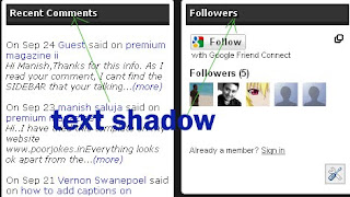
Text Shadowing

Text shadowing is one of the rarely use decoration for fonts of a website and sometimes they come unnoticeable when incorporated into a site.
A shadow on a text makes the title easy to read and view by the reader, they catch attention and looks prettier than a normal font.
Adding text shadow does not takes you a couple of minutes. With just one line of html code you can make the font different from the other.
Here is a complete sample:
text-shadow: #FFFFFF 2px 2px 2px
Explanation:
#FFFFFF - color of the shadow (be sure to make it different from the existing font and also consider the background so that you can see the effect).
2px 2px 2px - this are the distance of the shadow. The arrangement of the code is 2px on the top, 2px on the right and 2px on the bottom.


sir i am using the same template that what u have here . i need to convert it in to magazine style . with image on left and content in right .help me how to do it
This template is an Arthemia conversion of mine from Wordpress. I will soon launch for download, there are still some bugs that I need to fix first. So keep coming back or directly subscribe to my feed to keep you updated.